Tuesday 24 November 2009

People and Space Interaction:

In looking more into other existing projects people have produced, I came across a website that takes a look at virtual reality called Negotiating the in-between: Space, Body and the condition of the virtual. Although it is not entirely related to the same project I am involved with within my group, I still found it interesting and useful as far as research goes. This is because it still displays images of light in motion and talks about space and the interaction of people, how they become 'liquid'. It also shows a grid of several images, photographs of someone with different interaction with different light source movements occurring.
Below are some images taken from the website to show this.

Reference: Crossings: eJournal of Art and Technology

The one below the two above show the grid of many of these images collated together.I found these images interesting as it is the movement of light that interacts with it audience and essentially the same as what we as a group are trying to achieve in this module.

Saturday 21 November 2009

More Methods Of Collecting Data

A more advanced method of tracking peoples paths and recording data other than pictures being taken could be sensors. The resulting information can be then put into diagrams for a visual display of how people interact in our chosen environment. This would also be useful in determining the most appropriate place and position for our projection piece.
An example of how this could be done is shown below, taken from Antisymmetric Space blog, sent to us by Shaun to have a look at.
Below is a video that shows how the data put into the a visual form and changes depending on the result of the data.

Untitled from Sergio Irigoyen on Vimeo.


Although using sensors to collect the information we need to interact with passing people is a very effective and interesting method, I will still be focusing on taking photos to record their movements. This is because by using this idea, the data is already in a visual form and can be easily seen and interpreted on where the people are and in return giving us our suitable projection place. Also, I find that photos are easily understood by people, as it is an exact print of how it is, so once we as a group have gathered them, and transformed the data we have found into something else that can be projected will be a much greater impact to the people we are trying to interact with, also making the progress of work along the way much more interesting.

Friday 20 November 2009

Website Improvements

If I were to know then what I know now, then I would definitely start the site much earlier than i did this time. This is because I am new to this and took me a lot longer to solve problems and remove any errors from my code than I would have liked. I would have also added extra code in my validation form that asks for a valid email address by checking if the email address entered had '@' symbol in it somewhere. I had previously had a code for this, but the alerts suddenly stopped working when it was added, but did once I took the email validation out. After hours of looking over again and again I could not find any problem with it, so I eventually gave in and left it out as I would rather have the majority working than none at all.
I would have also liked to have added a photo gallery to display some of my traveling photos to link to my traveling section in my 'About Me' page.
Considering this is the first website I have ever produced I feel that it was a good effort and has definitely helped me in understanding the code I have learned and being able to apply it to a project. It also helped having a project that people care about because I wanted to have a website that looked good and was pleasing to the audience. This meant I was more determined to get the code correct throughout the website to keep it as good as it could be.

Finished Website

I have now completed my website and is now online. I have changed small parts of the site such as an added link in my menu linking my blog to the site. I also slightly changed the background image, as I felt the previous image shown in my previous post was too white for the look I was trying to achieve. I also thought though that the all black background was too much aswell, and needed just a little something to break up the text and make the page look slightly smaller.
To make this happen, I used another background image, but one that had much less white in it, keeping the overall look of my site black which is how I wanted.

Below are print screens of how my site now looks.

Home Page:
Interests: Including images to show audience rather than large amounts of text as I have previously discussed.
NPNG: I also added a page for videos of a skate team I am a part of, No Pain No Gain Skateboards. This is for users of the site to view, so not only are they able to read about my hobbies in the Interests page, but to see what I get up to in my spare time with mates. I also changed the YouTube embed code to give the videos on my page a red boarder to keep the the same colour choice of my site, aswell as making the video windows larger for better viewing quality.
Contact: My final page is a Contact Me page. This would give people who visit the site to leave a comment with their name, email address and then their message. I also added JavaScript to write a conditional statement to avoid people missing data in the required fields.
Now that I have completed my website, I must validate it ready to hand in. To do this I used The W3C Markup Validation Service where I was able to copy and past the URL of each page to make sure it passed validation. It didn't to begin with, but luckily it was only minor errors in my code such as not ending my image tags with alt and not closing paragraph tags before opening a new one, so I was able to correct it and have my pages revalidated and passing.The only pages I was unable to get to pass validation were the pages that included YouTube videos. This is because the validation service did not like areas of the code that was required for the videos to work. Because I these videos were on additional pages, I decided to keep them as the 4 compulsory pages of the website all passed.
If you want to visit the site, visit olza.co.uk

Thursday 19 November 2009

Interaction With People

To find our location for projecting our produced images onto, we need to first determine where the most amount of human traffic is. This will give us a greater opportunity to interact with them when displaying our projections upon our chosen surface.
We have been told that our drive-by projection window is between 16:00 - 18:00, so this will require visiting Union Street again to research into where the busiest area is, then finding our desired projection surface.
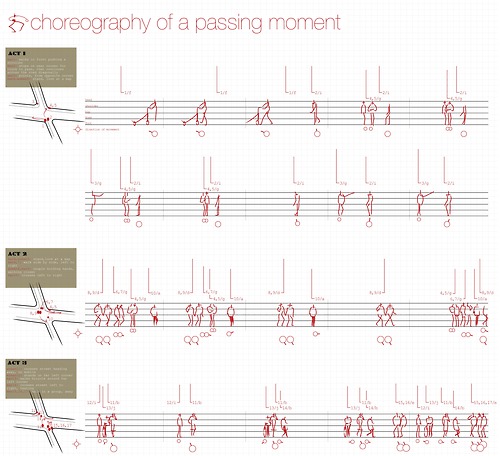
Existing projects have gone about recording data from people in different methods. Here is one example of how people's daily routines may be recorded and documented.

All images below were found at paperspace: design and used for research purposes helping me develop my own ideas of how I will begin to record peoples paths.

1234
1: This image shows the general movements of people by collating images to create one, and then all paths can be seen in one.
2: Image 2 begins then to get more specific by taking photos as time progresses making notes of the change in peoples paths, then beginning to define the different types of people that crossed the cameras sight. It also shows the plan view on the right hand side of the image showing exactly the cameras position and span the cameras capture span has.
3: The 3rd image now begins to focus more specifically on people only that passed, also documenting the types of people they were as previously done.
4: Finally the last image is a key that defines each person/people type by explaining each diagram of stick figures.

I find this method of logging peoples path very useful, but not the method I will be choosing when making my own recordings. I do however really think the plan view of the camera, and having a camera stationary taking photos over a period of time is a very effective way of capturing human traffic in a specific area. This will be considered when I begin to plan my pedestrian observations.

Another example found was not only the preferred paths people pursue, but the line of sight they make throughout their journey. The images below were taken from Chao Han's blog. Using peoples moving eyesight to record where and what they see in all directions.

These images show the kind of information that is extremely useful to my project. By recording the eyesight of people in the area, this will hopefully provide us with a specific building/surface to chose when considering where to project. If we can find a building/surface that we notice people look at regularly, our chances of interaction with passing people will become much greater.

we as a group now must pay another visit to Union Street with armed with a camera between the hours of 16:00 and 18:00 to determine where the most suitable place would be to park our black van and project our images upon.

More Projection Work

By Looking at more projections, It will help give us a more specific idea of what we all want to achieve in our groups projection. These videos were found on youtube of building projections on a large scale.


These videos are example of huge scale projections. unfortunately we do not have the ability to produce such a large projection, so when creating our own it will be to a much smaller scale. The kind of size we will be aiming to produce a projection for is for the side of a smallish building due to our projector being stationed in a small black van and projecting out from our choson location.

An example to the size of projection we are aiming to produce is shown in the video below:

Improvment Through Projection

An extremely effective way of transforming a building to make it look like something else without having to build a new one is just to simply project certain images onto the wall/face of the specific building we have chosen to focus on. This enables us to make changes to its appearance that can be visibly seen by passing people in the area and hopefully grabbing there attention and interacting with it.

The images below were taken from the website: Abelardo Morell. The images show the kind of projections that we as a group will begin to plan creating ideas and generating images of our own to project.
The only difference being the fact that we will be projecting images onto buildings, not buildings to the inside of rooms, but it is still a very useful piece of research and will definitely help when producing our own.

Poject For Improvment

The point of this transformation is to improve on a particular place/building in the Stonehouse area. An interesting website that hold many images and videos that give good examples of what we are trying to achieve in our groups is Squint/Opera. Check out this site for more examples, but I found this video and and image very useful. It is a clip that shows ways and opportunities to cut down on CO2 emissions of a building, breaking down each aspect and explaining on the way.

For the video to this potential improvement, Click on the image above and chose option 'VIDEO'

By using this as research, we can also create a similar goal to improve the building we have chosen to transform and therefore improve.

Stonehouse Progression

I was originally focusing on the traffic of vehicles passing through Union Street, even more so passing the Dance Academy. We are now more focused on influences people have on the specific area we have chosen and how they can change the way the place looks. A good example of this is the NOX D-Tower, where during the day it looks a cream/natural colour, but by night it records data and depending of the result of the data will determine the colour that the LED's light up, giving the whole structure a coloured glow.

During Day:

During Night:

For more information about this structure, click here and here

We will be looking at this kind of concept to create our own data from our specific area's, in my case Union Street and will be putting the result of that data back into the area for interaction with the traffic of people.

Tuesday 17 November 2009

Personal Development Planner - PDP

Personal Development Planners, abbreviated to PDP are extremely useful methods of providing a clear focus on your goals and gives you the ability to manage how to achieve them. They also provide deeper learning which is an essential skill and something that enables you to become more independent and use initiative with how to improve on your own progress.
PDP's also makes you much more reflective in the way that you can see exactly what you what, how you will achieve it and how you will know when it has been achieved. By carrying out this strategy of problem solving it allows you to see what you have achieved, giving more confidence and to be able to be proud of yourself, not to be disappointed. It also helps identify opportunities that may perhaps not have been originally discovered, which in turn improves your performance.
Notice in all of that text, the words you, your and yourself were repeatedly used throughout, emphasising that the personal part of this planner is key in making it succeed. It must be goals specific to you, created by you, else it will not work. Tasks set to achieve all goals must be smart, being within capability and in a realistic time zone.
They can be used for Academic education, your personal lives and/ or careers.
Below is an example of how you could carry out this planner that I have completed. It doesn't have to be in this structure however, I just found this easier to use as it is clear and each goal, action, evidence and target time to be achieved are set out in a way that is visibly quick and easy to refer back to.

My PDP: Click on image below to view


Manifesto

A Manifesto is a public declaration of principles and intentions, usually in a political nature, but can also be written based upon religious beliefs, referred to as credo meaning a statement of beliefs, or in a life-stance style. This means it is written as one person views a subject to be of upmost importance.
The writing of a manifesto is in the style of almost shouting at the reader, DEMANDING the points your putting across, it is intended to be written in a way that must be read, and must be dealt with. Your demands MUST be met.
Here is an example, manifesto I have written, although there is really only one thing I feel strongly enough about to feel the need to write a manifesto for and that is skateboarding. This is because this is a personal and for years I have been the victim of trouble due to skateboarding, for no other reason that people not understanding it. So here are 10 points that I feel strongly about:

  1. Every Skateboarder should be left alone, FREE to explore new boundaries and express themselves without interruption
  2. All Skateboarders should be entitle of FREE opportunities to push the creativeness of the sport and of their mind
  3. Every Skateboarder should have the FREE choice of exercise they wish to embark on
  4. Every Skateboarder should not have to deal with police as if they are a criminal, they are NOT and we will never stop
  5. Skateboarding should NEVER been seen as wrong, vandalising, or damaging
  6. Skateboarding is a form of ART and should not been seen as any less
  7. Skateboarders have been moved on for TOO long and this must not continue to happen any longer
  8. Skateboarding for young and old, male and female has been LOVED by thousands for many years, it is time for it to be recognised it is here to stay
  9. Skateboarding WILL stay, get used to it and understand its many benefits to many people
  10. Skateboarding is NOT a crime

Monday 16 November 2009

More Looking At Websites

Another website I look at a fair amount is the DC website. This again is again because I follow the skate scene along with a touch of snow boarding and motocross. I am also a fan of Ken Block's Gymkhana videos and this website has it all. I also like the way this site has many photo's and videos as they are of sports I am interested in.
It has now also began to showcase the last 20 years of professional skateboarder Danny Way, who happens has skated professionally since he was 14 and gone on to break world records for the highest backside air out of a quater pipe, measuring 23.5 ft, also setting the long distance record with a backside 360 at 75 ft, largest bomb drop from the Hard Rock Hotel & Casino at 100 ft into a 40 ft ramp, gapping the great wall of China as well as breaking the land speed on a skateboard at 74 mph.
Because of these achievements he has become extremely well known and websites use this to draw attention to audiences. This also supports the reason I have decided to focus on images and videos rather than large amounts of text to read.

Print screen of the DC website:
Also Check out DC website

Danny Way also has his own website, documenting on all his latest and oldest news including photos and videos. This site is also Black which in my opinion looks much better.


Now that I have already built a simple website which is shown as print screens in the post below, I can now begin to make it more unique to me, adding images and videos.

Danny Way Official Website

The reason for this post is to determine my audience. I aim to target an audience that has similar interests to me, as the videos and images I put on my website will mainly be of skating.

After Experience

Now that I have been down to the Stonehouse area and specifically looked at Union Street as a focus point I am now able to generate a new map of the place with a bit more experience and feel to it. Below is the map and key that I managed to come up with.
As this map shows, there are only a few naturally green areas in Union Street. I have added images to show what exactly can be seen from certain standing points on the journey down the street which helps when referring back to. There are also a huge amount of artificial lighting down the street from street lamps and surrounding buildings in the area.

More Website Ideas

I didn't like the fact that the images/logos I came up with had a lot of white in them. This did not fit in with the black and darker look I am aiming for with my site. To change this I went back and did some more. Before hand however, I also wanted to create some sort of logo that could the site could be identified with. To achieve this I had another look at my digital signature I made for the module IDAT 107, by using the same style as the Love Park does in Philadelphia.
Digital Signature:
This is what I managed to produce from the above and will use it for my header to the site.

Saturday 14 November 2009

Website Building

I know which websites I like, so creating my own should be fairly simple. I definitely don't want too much going on, this can distract users and make navigation of the site much harder than it needs to be. I also wanted to create some sort of logo/image that can be recognised with my site. I came up with black, white and red being my main colours as black and white are complete opposites and red was to give the site more a bit of colour. They also contrast with each other which again makes it easy to identify. The menu is located exactly the same on every page, also making it easier to navigate, which is at the top making it clear and easily found.

This was the first image i came up with, but it did not turn out the way I wanted, it was way too small to be used and not what i was after.
So I went back and came up with a similar logo/image using Illustrator to make the image much larger and clearer. I also kept it simple by just using the domain name 'olza' to keep it specific to my site.

So this is the image i came up with to use for my site. I definitely wanted to use this, but was not sure of whether to use it as my back ground image, or the header of each of the site pages.
Here are some screen shots of the different ways the site may look by experimenting different uses of this image.

Without Background Image:With Background Image:
I am currently split between both these options as both have hold characteristics I like. The print screen with no background image I find looks good as its easy to read and nothing to distract users, I find it also makes the menu much easier to use as its extremely clear and separate to all other text.
The print screen of the site with the background also looks appealing as there's something extra, but not too much that it takes away the main focus to the text. It also makes the site more unique having a background image that I have created myself.

My choice of font was Arial as it is easy to read, but also looks different. I was tempted to use Times New Roman as this is sans-serif font and has been proven to be easier to read as the flicks of the letters bring them closer together, however, this really only applies to large amounts of text that will be read by users for long periods of time. The purpose of my site is not for long reading about me, but more visual in the use of pictures and video. I wanted to focus on this as it is much nicer for a user to see images and clips rather than to read, this should keep users interested for longer and keep them visiting again to see updated pages.

Thursday 5 November 2009

Digital Signature

For our first assignment, we have been set the task of designing our digital signature using Illustrator. We had to use out full first and last name to create this and only allowed to change the font, size and colour.
The signature had to reflect on how we feel, and the interests we have. I love skateboarding and definitely wanted to incorporate this into my personal signature, but we were told that making the text look like an object was not a good idea.
So instead of making the text look like a certain object, I decided to use the style of writing and positioning that I knew would relate to skateboarding.This the welcome people get when visiting Love Park in Philadelphia. It happens to be a place where many Professional skateboarder used to go to skate, so I used this style when creating my digital signature.
I started with the o, l, i and v in the style of the LOVE sign in Philadelphia. This is because for many professional skateboarders this was a place they could go, reflecting on my love for skateboarding. I also highlighted the o, l and i because I'm always called Ollie by everyone. All the letters are in different fonts because my mind is always up and down, never really focusing one just one thing. Although I tend to be all over the place, I still like to be organised, so all the letters are in order. The letters are also all different as I like things that are aesthetically pleasing, so I continued to change the font until I found a style that best fit the feel of the letter.
I would usually use a lot of colour, but for this I decided to use red for the LOVE style start of the signature, and on the g as its the beginning of my second name, keeping the rest black to further highlight this. To finish I added the black stroke around the o, l, i and g as to many I'm known as Ollie G.http://www.paul-rand.com/index.shtml

Tuesday 3 November 2009

Networks

Networking can be seen as collective patterns, a form of organised events choreographed in a certain way. This idea can be supported with physical evidence taken from the animal Kingdom.
here are some examples...

Birds:

To see a video of this example, click here

Even in the way that we organise ourselves when we move in a group or crowd, how we position ourselves before we are comfortable with where we chose to settle in such an environment can be determined by different factors.
For instance, If in a class room a large number of people were to walk in and be asked to take a seat, which one would they chose, thinking abou
t its location and how the surrounding environment may be responsible for you making that decision. Such as whether or not you are able to see the front clearly, whether you are uncomfortable with people sitting behind you, wanting a seat near a window...maybe its just where your ended up and were forced to stop there. Possibly the fact that you don't care and it was convenient to just sit anywhere. These points can be seen and should be considered.


Linked:
Albert Laszlo Barabasi was a Hungarian scientist , specifically network science and wrote a book called linked. This book is all about networks, on the cover it reads, "How everything is connected to everything else and what it means for business, science and everyday life."
In 1999 he introduced the concept of scale-free netwo
rks and proposed the Barabasi Albert Model. This was to explain their widespread emergence in natural, technological and social systems, from the cellular telephone to the World Wide Web or online communities.
From: Albert Lazlo Barabasi - Wikipedia

Albert Laszlo Barabasi:


Barabasi Albert Model:
These 3 diagrams show how the connection of nodes can represent different connections in networks and how strong they function. A method of showing how well they work in networking should 1 node be broken.
The centralised diagram (a) shows a very weak structure, should the middle node be cut, then all corresponding nodes would cease to exist.
The decentralised diagram (b) shows a stronger network of nodes, but far from very strong as should a node coming from the middle be broken, then the following branches from that node would be lost as well.
The third diagram (c) is a distributed example. This is by far t
he strongest, and much more solid structure in the form of a mesh. Should any one of the nodes break, then they are all still connected via other surrounding nodes, being much more reliable.

Power law:
This is a speacial kind of mathematical relationship between two qualities. It is an active area in scientific research and are present in both natural and man made worlds. Power laws can also describe other relationships such as metabolic rate of a species and their body mass, called the Kleiber law.
This is an example of a power law graph demonstrating ranking of popularity. To the right is the long tail, to the left are the few that dominate (also known as the 80-20 rule).


For more information, click here


Flight path Networks:
I noticed this type of networking on my travels when was shown by a travel agent the flight paths that Quantus airline make when transporting passengers all over the world. The travel agent showed me this route worldwide map to help me decide where I could fly from and to and in what order would make most sense economically with time and money. The network showed the possible connections between airports worldwide.

Animated Network:
To see how these flight paths work, click here and you can select which route you wish to see.

Internet network:
The internet is a global network which allows almost any computer to connect and exchange information any where worldwide.

This was how Albert Laszlo Barabasi visually saw global internet networking:


Biostatement

Hello there, my name is Ollie Griffiths and I was born in 1989 at Poole hospital. For the majority of my life I have lived in Blandford, Dorset. I began education at Pimperne First School, then Milldown Middle, followed by The Blandford Upper to complete my GCSE's and continue on my education by completing A levels. I then took a year out of education to travel, venturing all around America, Fiji and Australia. From there I returned back home to attend The University of Plymouth. I am currently living in halls of residence and in my first year of my Multimedia, Production and Technology course.